 0 saved
 79.3K views


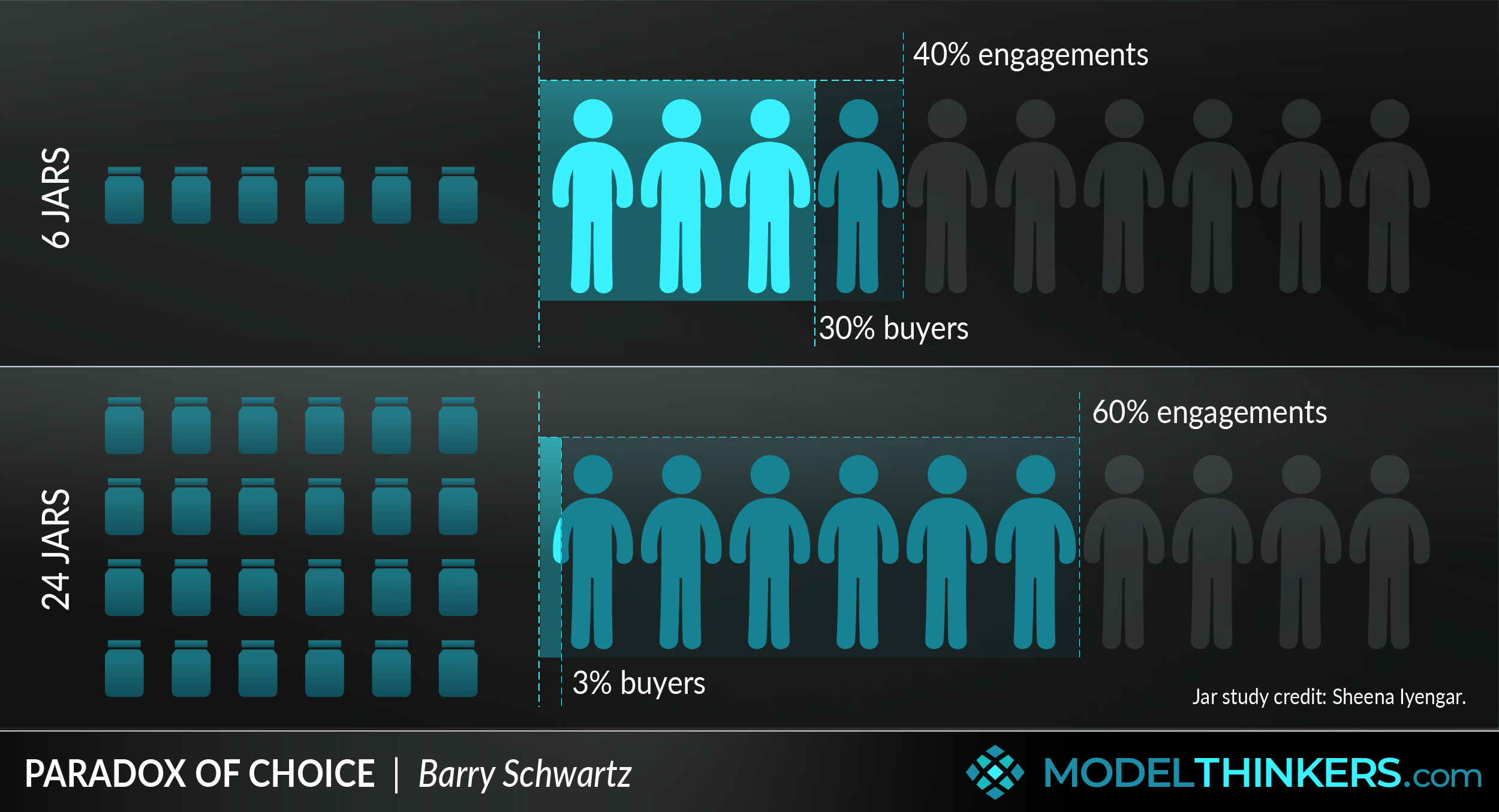
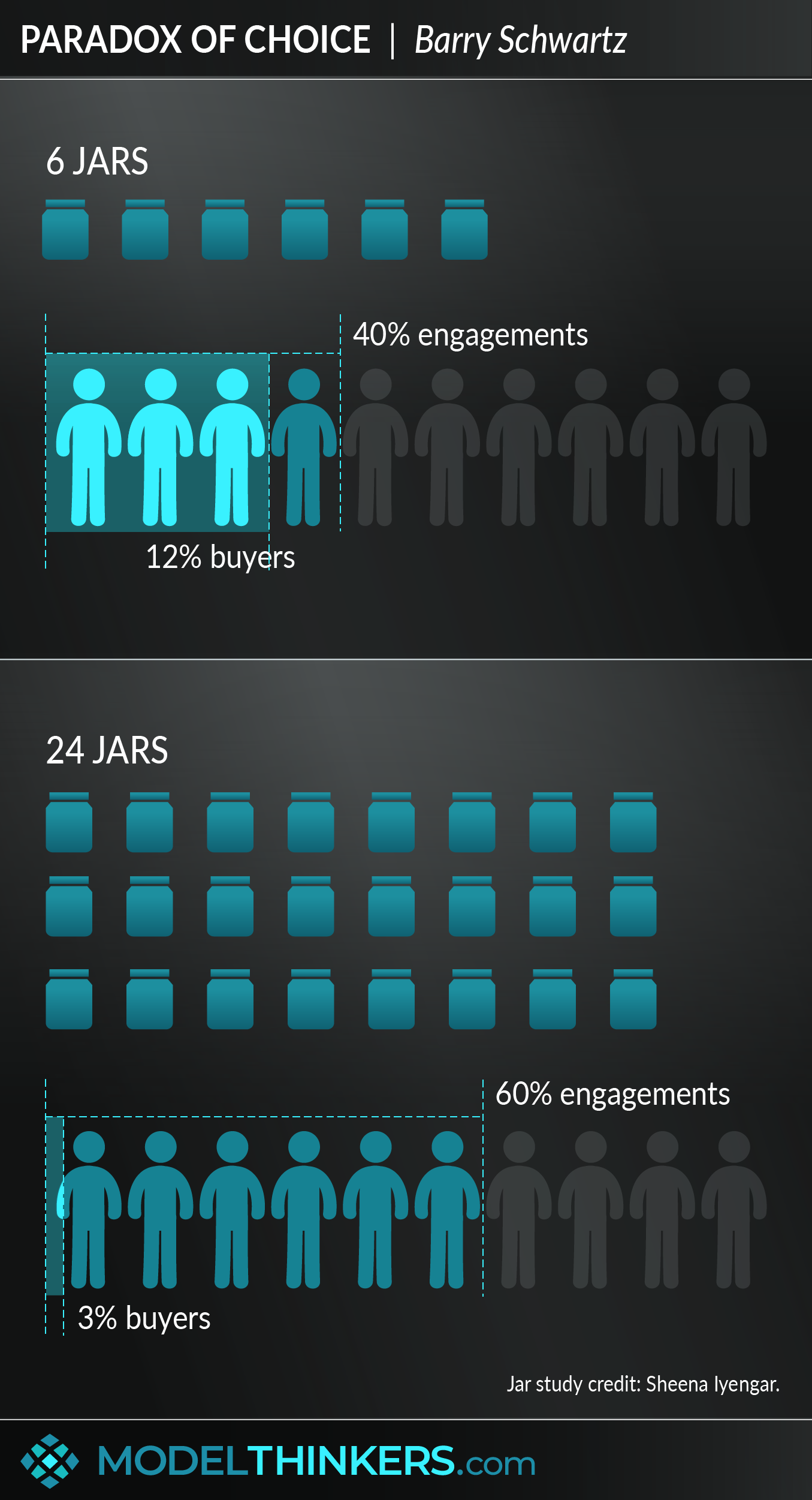
In 2000, Professor Sheena Iyengar from Columbia University famously conducted the ‘jam study’ as an exploration of choice and decision making. In the study, Iyengar and her researchers first displayed 24 jams in a busy supermarket, encouraging free tasting. This abundance of choice saw 60% of customers stopping and tasting the jam, but only 3% making a purchase.
Next, the researchers set up the display with 6 jam jars. This time there were fewer customers stopping, only 40%, but the actual purchases went up tenfold, to 30%. This study became a central example in Barry Schwartz's 2004 book, The Paradox of Choice.
The paradox of choice is a phenomenon where an abundance of options can counterintuitively lead to less happiness, less satisfaction, and hamper the ability to make a decision.
BEHIND THE PARADOX.
Some of the reasons why more choices might result in lower conversion rates include:
-
More obvious Opportunity Cost: when presented with options, the loss of the choice you didn’t make will potentially be heightened in your mind. Also known as ‘FOMO’ or the fear of missing out.
-
Decision fatigue and overwhelm, with an understanding of thinking fast and slow: where every conscious decision you make has a cognitive cost, making such decisions can be exhausting.
AN INFLUENTIAL MODEL.
The paradox of choice model made a significant impact at the time — Schwartz’s book became a bestseller and its premise was endorsed by many credible sources. Since 2004, modern consumers have only been more inundated with choices — from media, online shopping, and don’t get me started on the rows and rows of toothpaste in the supermarket! Which makes the backlash against the model all the more surprising.
THE BACKLASH AGAINST IT.
This backlash came to the fore in 2010 with a meta-analysis by Benjamin Scheibehenne. His results are often held up to be a straight rejection of Iyengar’s research, revealing difficulties replicating the findings of the jam study, given that he identified an average nil effect. Digging deeper, the nil average hides the fact that the actual results were quite varied — with choice sometimes increasing conversion rates, and other times minimising it.
CHOICE OVERLOAD vs INFORMATION OVERLOAD.
One distinction Scheibehenne made in trying to understand his findings was the difference between ‘choice overload’ versus ‘information overload’. Indeed Schwartz, revisiting his work, pointed out that the paradox of choice does not apply when a person knows a domain well and can be mitigated with an effective presentation of the choices.
MEANINGFUL CHOICE AS A FACTOR.
Others have claimed that the reduced conversion rate arises from the ‘lack of meaningful choice’, rather than choice itself. And some researchers have since pointed to additional moderating factors, including the:
-
Difficulty of the decision task: how much work is involved in making a decision.
-
Complexity of the choice set: how easy is it to make comparisons.
-
Level of uncertainty: the ability for a consumer to evaluate options or be clear on their preference.
-
Decision goal: whether it's to minimise cognitive load or find the best option.
SO HOW USEFUL IS THIS MODEL?
Where does the debate leave you in deciding choice sets in your marketing campaign, product strategy, or simply striving for a happier life? Well, it’s complicated. Dare we remind you that the Map is Not the Territory?
The truth is that the paradox of choice model has its uses but also has clear limitations. When applying it, use experimentation methods such as Split Testing, to identify the impact on your specific challenge and context. Also, consider some of the above factors in deciding whether the choice you might be providing is a blocker or a benefit. See the Actionable Takeaways below for more.
IN YOUR LATTICEWORK.
This model is often viewed as part of broader Behavioural Economics, so is informed by Fast and Slow Thinking. As mentioned, it has also been explained by the Opportunity Cost.
In designing for user interaction, whether it be in delivering a UX, product range or anything, consider addressing this potential challenge with models such as Occam's Razor to simplify; the EAST Framework to design Nudges; and/or Anchoring to frame and influence a user experience.


-
Reduce the amount of choice.
Where appropriate, experiment with reducing options.
-
Provide clear comparisons or implications for choices.
Consider how to present key information to facilitate an easier choice between multiple options.
-
Provide clear and low friction pathways.
Use a strong and directed call to action; a personalised pathway; social or system based recommendations; or other strategies to highlight a simple decision path for the user.
-
Provide social proof.
Leverage people’s opinions through likes, shares or votes etc, to indicate what is being recommended by the crowd — this is particularly effective when the ‘crowd’ in question has a meaningful connection with the user.
-
Organise and present effectively.
Consider how you categorise, what you present where, and how you direct attention to support easy decision making. Refer to the EAST framework for this and the previous point.
-
In your own decision marking, strategically limit your own choice.
You might do this by creating rules that you apply to non-essential issues (e.g. Steve Jobs and Barack Obama famously wearing the same clothes repeatedly); identify what decisions increase anxiety and ‘paralysis’ and consider how to reduce the choice in them; consider focusing on ‘good enough’ to help let go of the opportunity cost.
-
Experiment and test.
Apply the paradox of choice as a principle rather than a fixed rule. Split test and experiment in your context to judge the impact.
As foreshadowed in the overview section above, there are a few sticking points with this model. Sticking points… jam… see what I did there? Yeah, okay, sorry about that.
Firstly, in 2010 after finding no significant variance in ten consecutive choice based experiments, Scheibehenne’s team embarked on their meta-analysis of the research behind the paradox of choice to that point. The average of those studies did not provide evidence that extra choice impacted decisions in either direction. However, there were quite stark results to either direction, adding more complexity and leaving more room for debate. Indeed this recent review of the research concluded that the area needed more study and that the ‘jury is out’.
Schwartz himself has not been shy in responding to criticisms. At once acknowledging the mixed results, he also maintains that the results are part of the scientific method. Schwartz explains: “the final story on the “paradox of choice” has yet to be written. But to me, it is a beautiful example of how science works when it is doing what it should. An important idea goes from “unthinkable” to “commonly assumed.” Then, further work reveals that there are limits to this idea. Over time, we develop generalizations that are appropriately qualified and contextualized. People understand something they didn’t before, and spend their time and mental effort in ways that are more productive and satisfying than was the case before.”
Procter & Gamble.
A popular example of the paradox of choice comes from Procter & Gamble. They decreased the number of Head & Shoulders varieties, their shampoo brand, from 26 options to 15. This resulted in more sales and 10% more revenue.
Do you even remember Yahoo?
Can you cast your mind back to the UX of the once-popular Yahoo — for those of you not old enough to remember, Yahoo was once a giant of the internet with a ‘portal’ styled homepage much akin to a busy magazine layout. Now compare that to the option that beat them — Google.
Here at ModelThinkers.
This model was in our minds when we designed ModelThinkers. We are very aware that people might find the growing number of mental models on our site overwhelming and freeze as a result. As a result, we’re working hard to mitigate this through the categorisation and UX design, presenting stories and clusters of models via the blog to help frame and connect them, and drip-feeding the models via our free weekly newsletter and the ‘model of the week.’
The paradox of choice sits within the behavioural economics domain, as it speaks to the potential irrationality of how you make decisions.
Use the following examples of connected and complementary models to weave the paradox of choice into your broader latticework of mental models. Alternatively, discover your own connections by exploring the category list above.
Connected models:
-
Thinking fast and slow: in terms of understanding the automatic pilot of most decisions.
-
Opportunity cost: in the more apparent cost when faced with an abundance of choice.
Complementary models:
-
Map vs territory: to understand the potential limitations and usefulness of this model.
-
EAST framework: to help guide choices through nudges.
-
Anchoring heuristic: in framing a consumer’s attitude and choice.
-
Split testing: an important model to test out options given the variations in findings behind these choice experiments.
The history of the paradox of choice and its detractors have been described in the overview section because they were pertinent to understanding and applying this model.
Explore the original Jam study findings are here, and although she did not receive as much fame as Schwartz, Professor Iyengar continues to work in this field — see Iyengar’s website and latest research here. You can view Barry Schwartz's original book called The Paradox of Choice here, and his 2005 Ted talk here.
 My Notes
Oops, That’s Members’ Only!
Fortunately, it only costs US$5/month to Join ModelThinkers and access everything so that you can rapidly discover, learn, and apply the world’s most powerful ideas.
ModelThinkers membership at a glance:


“Yeah, we hate pop ups too. But we wanted to let you know that, with ModelThinkers, we’re making it easier for you to adapt, innovate and create value. We hope you’ll join us and the growing community of ModelThinkers today.”
